 b9baed2c74
This PR introduces a new UI element type for Gitea called `flex-item`. It consists of a horizontal card with a leading, main and trailing part:  The idea behind it is that in Gitea UI, we have many cases where we use this kind of layout, but it is achieved in many different ways: - grid layout - `.ui.list` with additional hacky flexbox - `.ui.key.list` - looks to me like a style set originally created for ssh/gpg key list, was used in many other places - `.issue.list` - created for issue cards, used in many other places - ... This new style is based on `.issue.list`, specifically the refactoring of it done in #25750. In this PR, the new element is introduced and lots of templates are being refactored to use that style. This allows to remove a lot of page-specific css, makes many of the elements responsive or simply provides a cleaner/better-looking way to present information. A devtest section with the new style is also available. <details> <summary>Screenshots (left: before, right: after)</summary> 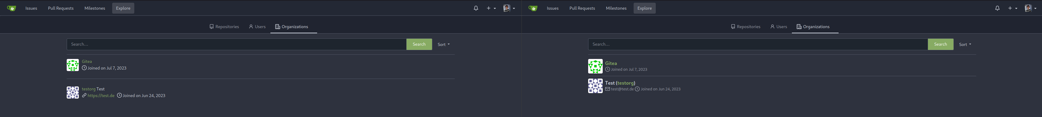  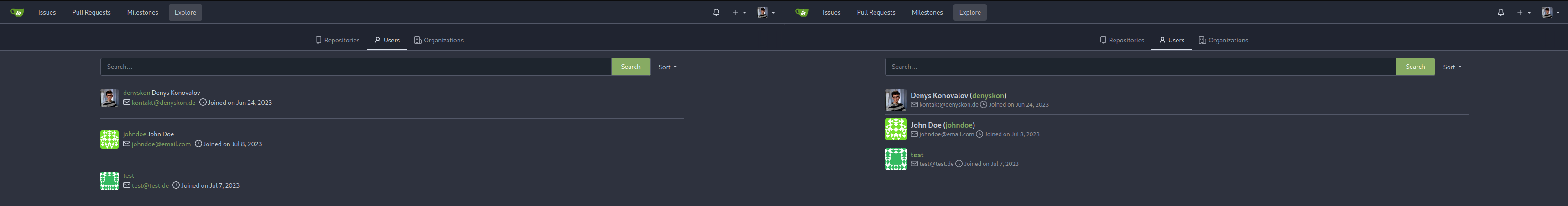  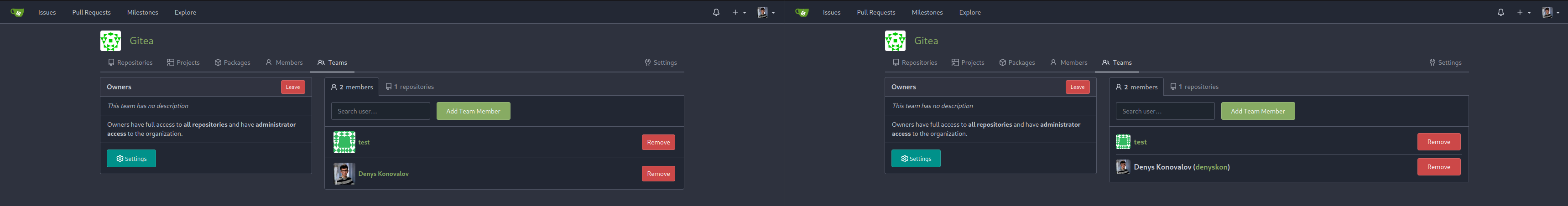          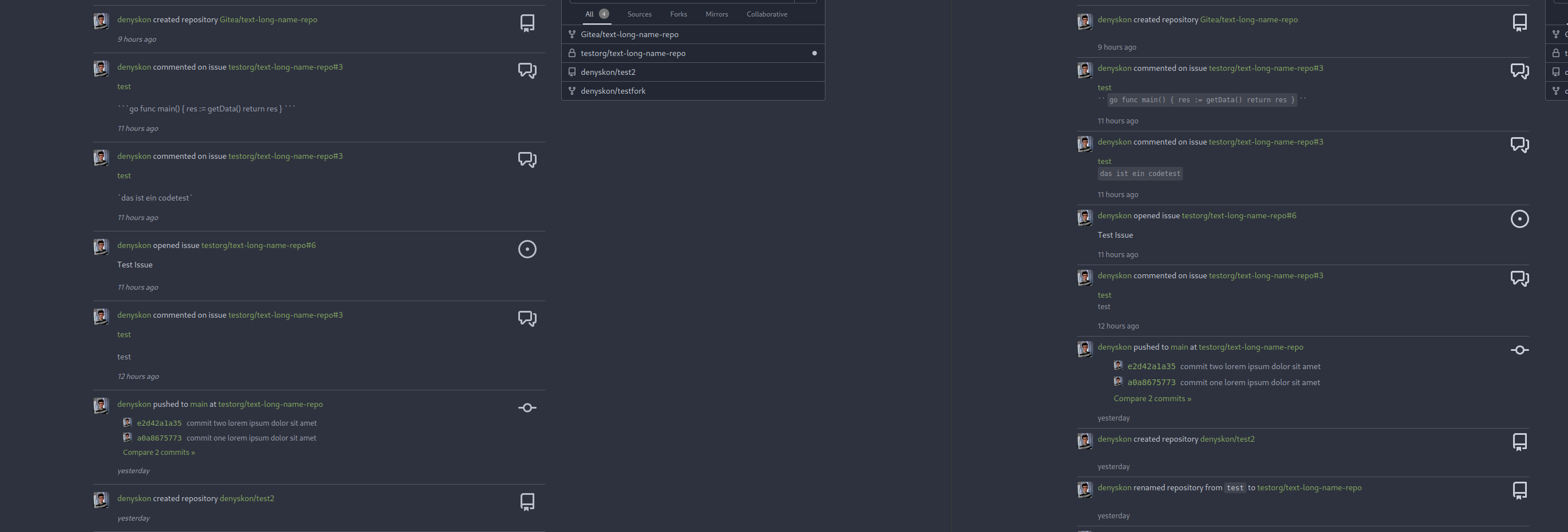  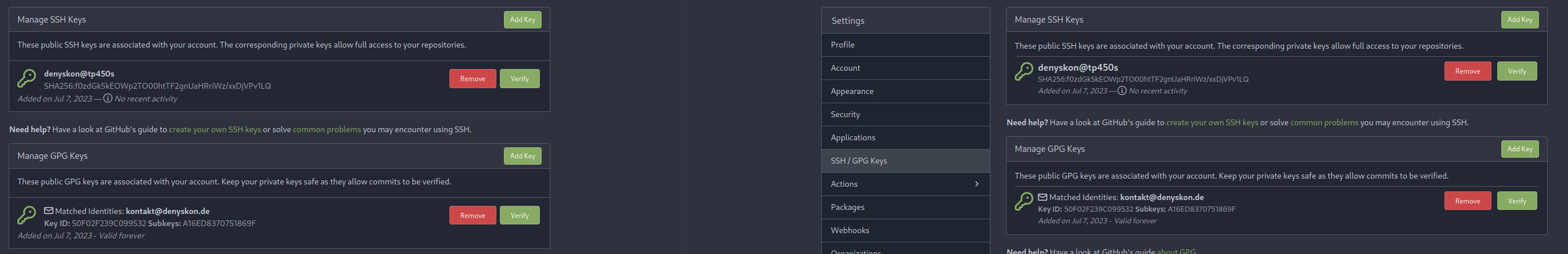  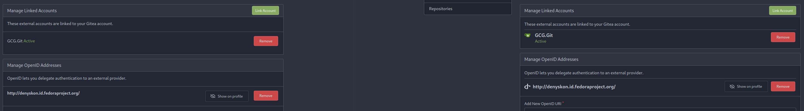 </details> --------- Co-authored-by: Giteabot <teabot@gitea.io>
56 lines
1.8 KiB
Handlebars
56 lines
1.8 KiB
Handlebars
{{template "user/settings/layout_head" (dict "ctxData" . "pageClass" "user settings organization")}}
|
|
<div class="user-setting-content">
|
|
<h4 class="ui top attached header">
|
|
{{.locale.Tr "settings.orgs"}}
|
|
{{if .SignedUser.CanCreateOrganization}}
|
|
<div class="ui right">
|
|
<a class="ui primary tiny button" href="{{AppSubUrl}}/org/create">{{.locale.Tr "admin.orgs.new_orga"}}</a>
|
|
</div>
|
|
{{end}}
|
|
</h4>
|
|
<div class="ui attached segment orgs">
|
|
{{if .Orgs}}
|
|
<div class="flex-list">
|
|
{{range .Orgs}}
|
|
<div class="flex-item">
|
|
<div class="flex-item-leading">
|
|
{{avatar $.Context . 28 "mini"}}
|
|
</div>
|
|
<div class="flex-item-main">
|
|
<div class="flex-item-title">{{template "shared/user/name" .}}</div>
|
|
<div class="flex-text-body">
|
|
{{.Description}}
|
|
</div>
|
|
</div>
|
|
<div class="flex-item-trailing">
|
|
<form>
|
|
{{$.CsrfTokenHtml}}
|
|
<button class="ui red button delete-button" data-modal-id="leave-organization"
|
|
data-url="{{.OrganisationLink}}/members/action/leave" data-datauid="{{$.SignedUser.ID}}"
|
|
data-name="{{$.SignedUser.DisplayName}}"
|
|
data-data-organization-name="{{.DisplayName}}">{{$.locale.Tr "org.members.leave"}}
|
|
</button>
|
|
</form>
|
|
</div>
|
|
</div>
|
|
{{end}}
|
|
</div>
|
|
{{template "base/paginate" .}}
|
|
{{else}}
|
|
{{.locale.Tr "settings.orgs_none"}}
|
|
{{end}}
|
|
</div>
|
|
</div>
|
|
|
|
<div class="ui g-modal-confirm delete modal" id="leave-organization">
|
|
<div class="header">
|
|
{{$.locale.Tr "org.members.leave"}}
|
|
</div>
|
|
<div class="content">
|
|
<p>{{$.locale.Tr "org.members.leave.detail" `<span class="dataOrganizationName"></span>` | Safe}}</p>
|
|
</div>
|
|
{{template "base/modal_actions_confirm" .}}
|
|
</div>
|
|
|
|
{{template "user/settings/layout_footer" .}}
|